Surfing the City – My Student Documentary

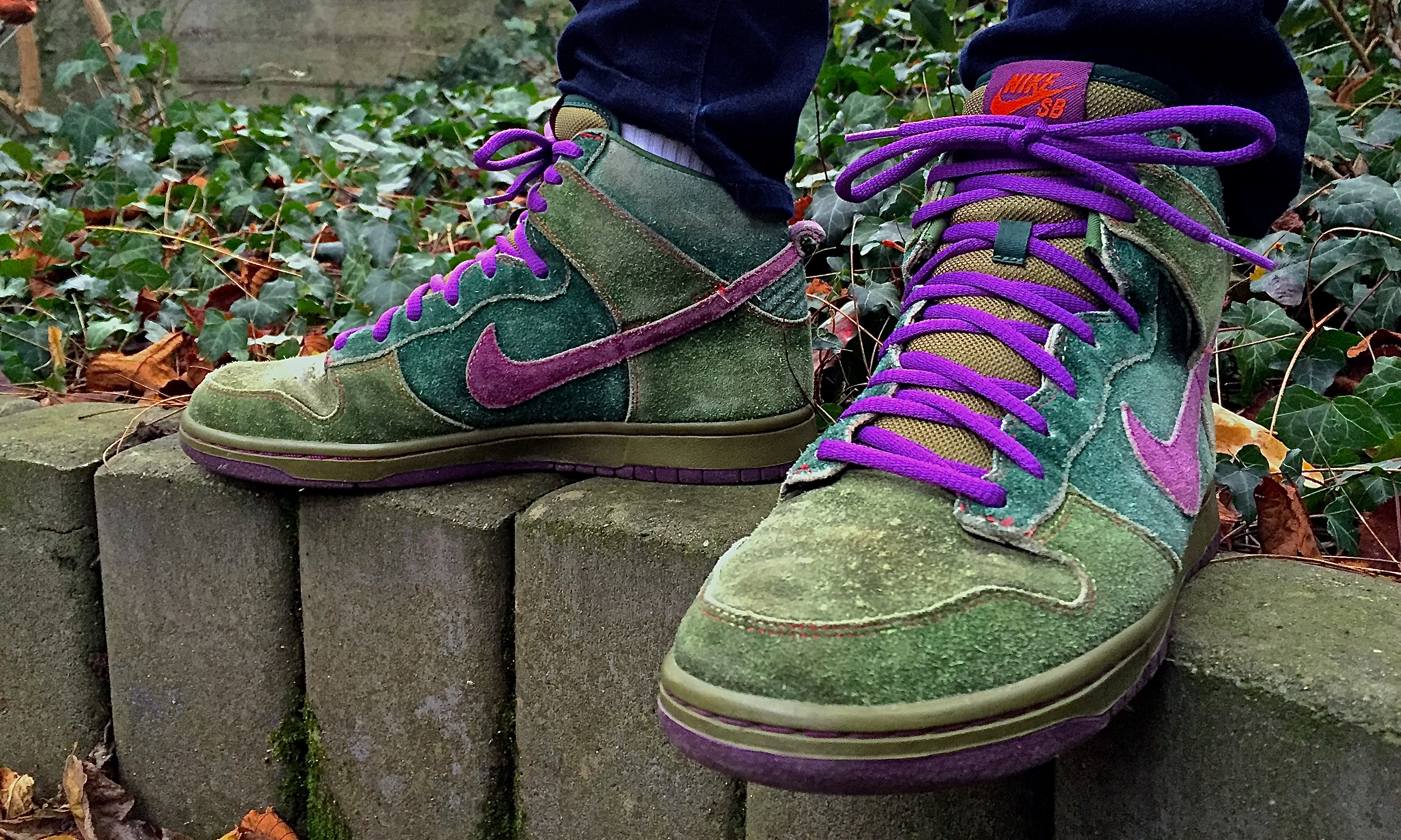
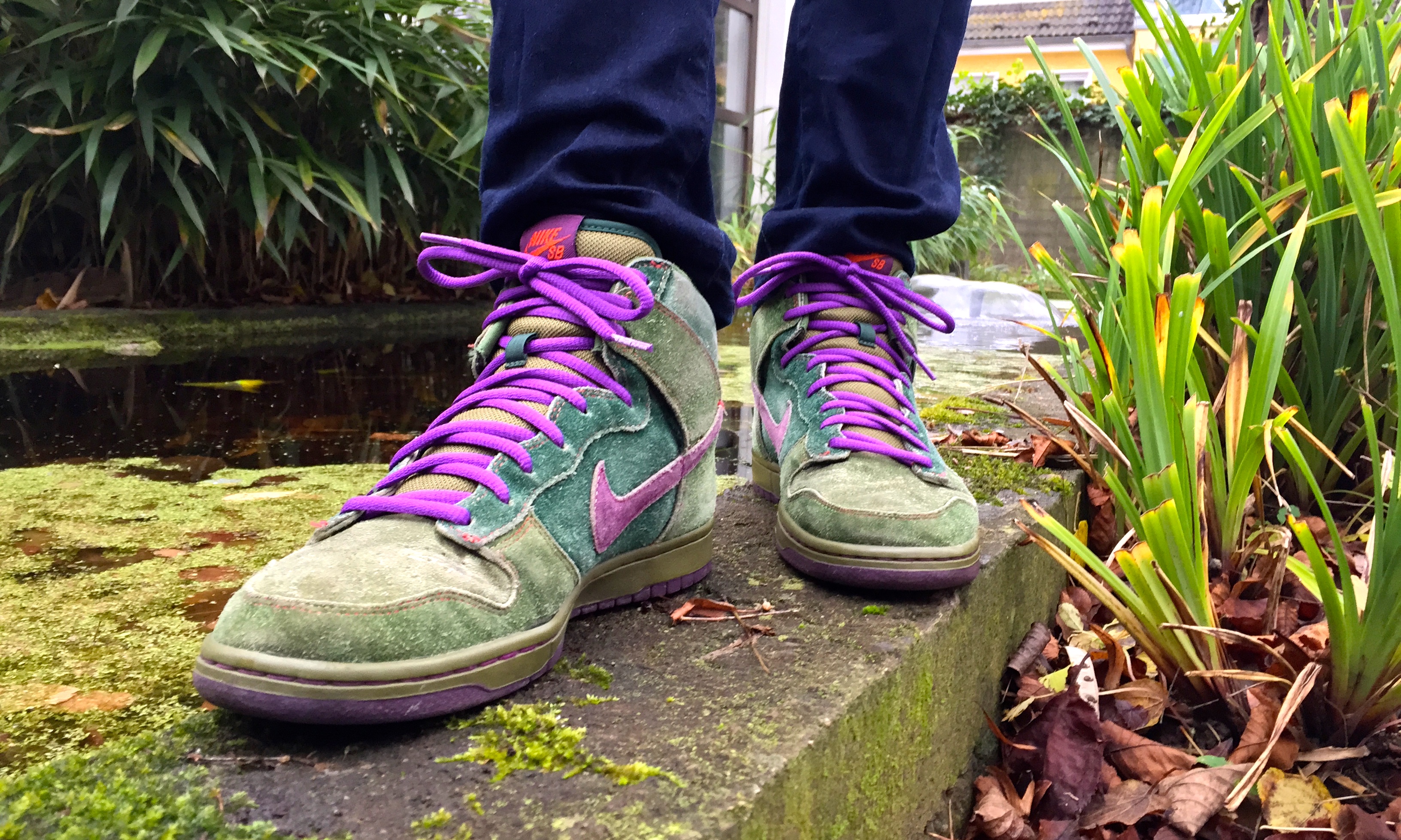
Darren Evons has been working at Cardiff’s oldest skate shop for 27 years. The 45-year-old from Rumney joined City Surf as a part-time help and has since taken over the little store located in the city centre’s High Street Arcade.

“Evo” was first introduced to skateboarding through his older brothers in the late 70s looking for obstacles in their urban environment to perform tricks on.
“We started skating the curbs down at Magnets,” he remembers. “It was basically a car park of the big kitchen shop. They had really good curbs so we just did slappies and curb sessions and things like that.”

Evo Back in the Day.png

Although skateboarding was quite popular amongst “Evo” and his friends at the time, it was far from being considered an acceptable pastime in South Wales.
“You used to get so much abuse for being a skateboarder. Back then you were just seen as a weirdo.”

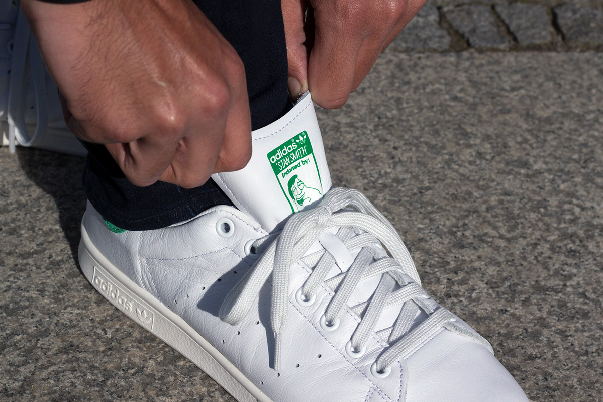
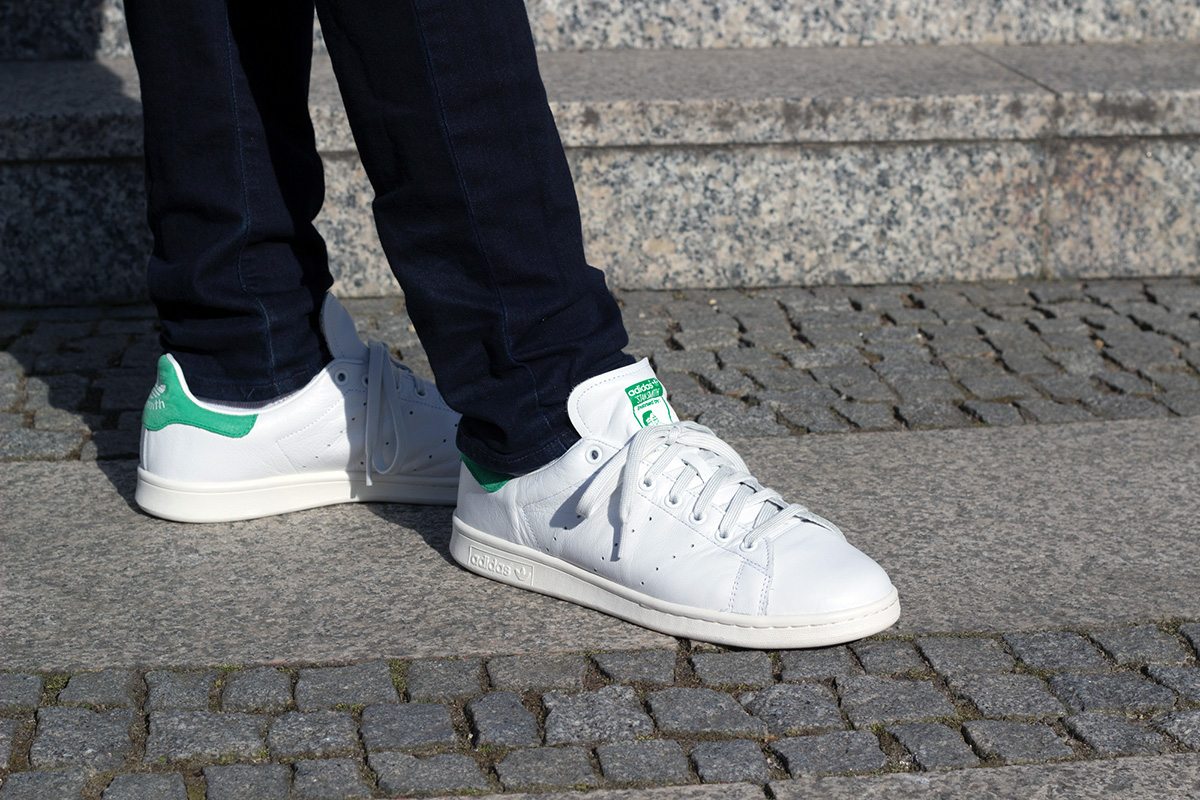
City Surf first opened shop in Cardiff 1986 to cater to this small community of “weirdos” and support the growth of the underground culture.
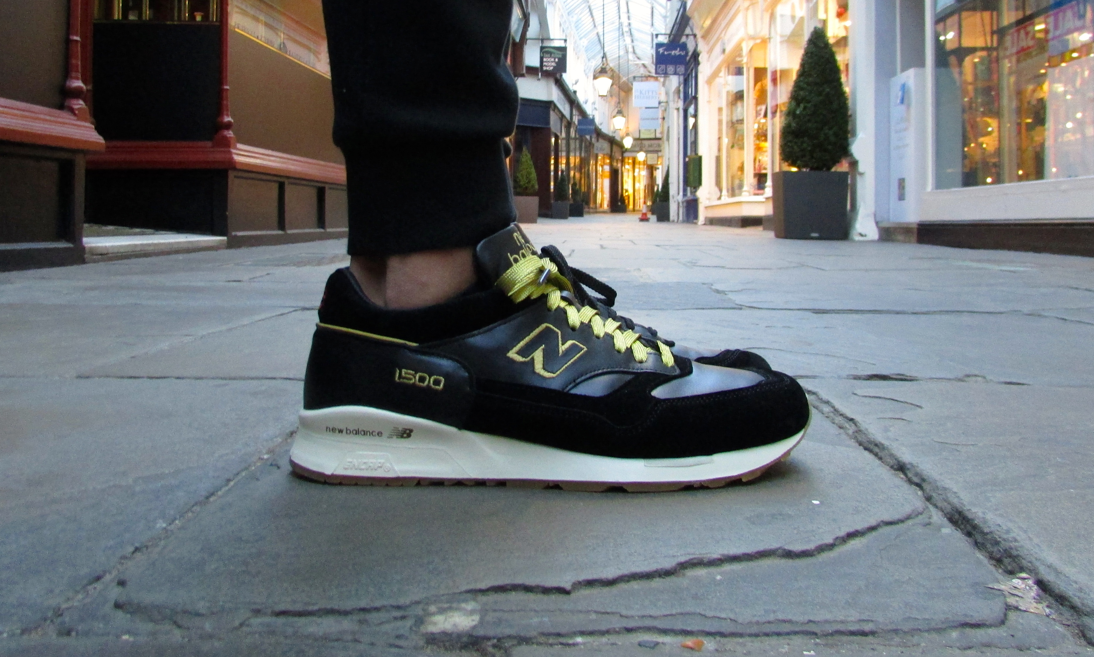
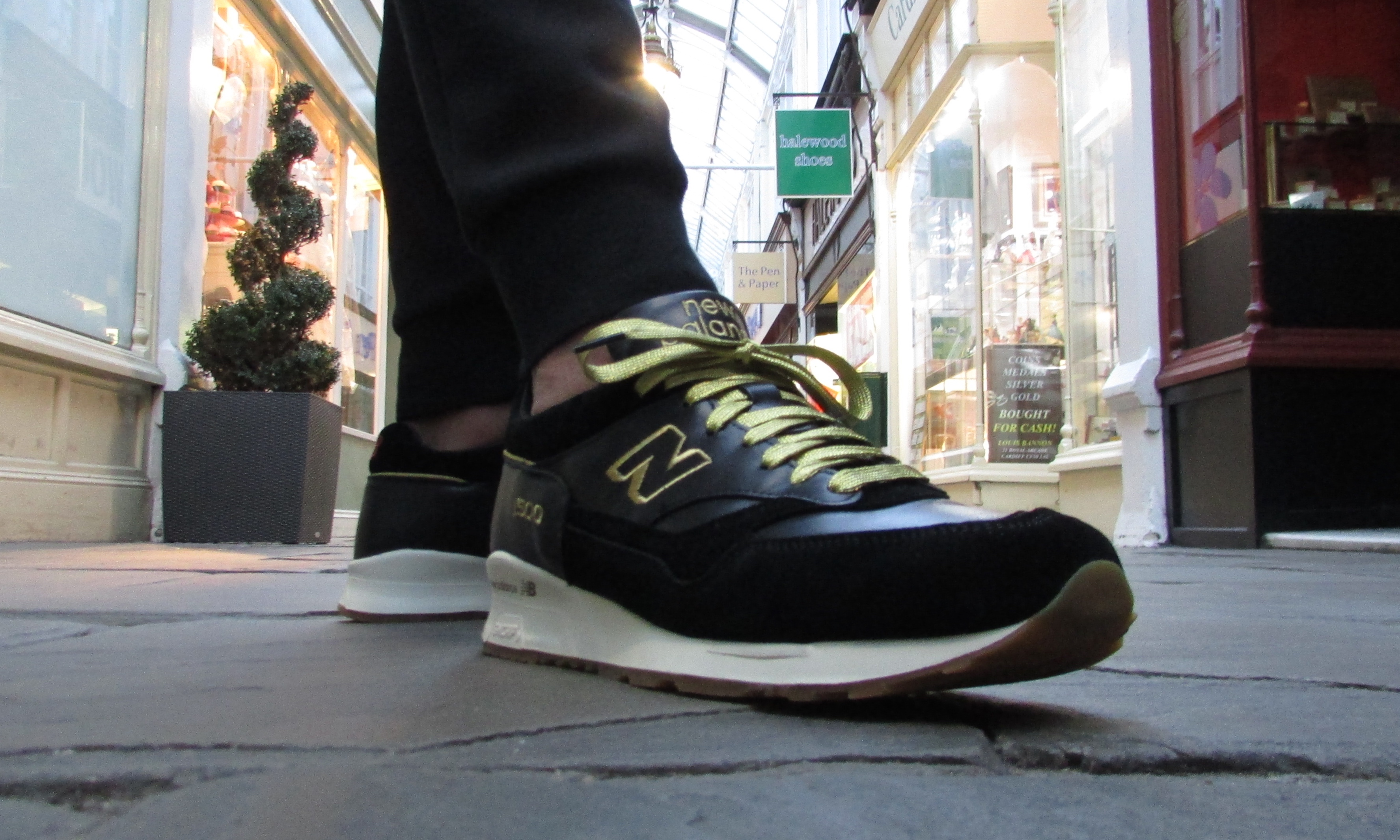
The community played a big role in Guto Williams’ decision to move to capital from the West Wales after finishing school. As the new kid in town he regularly visited City Surf to meet new people to go skating with.

City Surf

“What’s good about the shop is that it’s a focal point for the skate scene. If you hang out around the shop long enough you get to meet everyone and soon enough have loads of people to go skating with.
“It’s pure fun just going out street skating with your friends, not really knowing what you’re going to find. It’s a great way to explore the city”
If not at City Surf, the scene would regularly gather in iconic skate spots to hang out and skate. Guto’s favourite spot was the “Blocks”, a set of stairs in front of Cardiff University.
“It was a really good place to meet and hang out and we didn’t often get kicked out. You could just turn up there any night of the week in summer and there would always be people there.”

Station Banks

Darren remembers the “Banks” near Central Station as one of the most iconic spots for skateboarding in Cardiff. The area on Wood St is now the site of the WE Bridge International building. His favourite spot is the Welsh Offices, which is still skated today.

“We would take little fly-off ramps and big gas pipes for rail slides down to Welshies and we would just session down there for hours.”

Bute Square later became a popular spot because it was unintentionally perfect for skating. The government later placed skate stoppers on the benches and ledges as discouragement, much to the frustration of skaters like Darren:
“Skateboarders look at the environment completely differently.
“We see something that we can use, which I don’t see as a bad thing so why prevent people from having a good time on it?”

Guto sees the action taken by the government as a motivation to take a different approach to the way he skates.
“I think it’s pretty aggressive architecture but in a way it forces people to get more creative with their skating. It doesn’t really stop people from skating, it just means you either have to skate that spot in a different way or you have to find another spot. I don’t think the government really understands that.”

Dear Diary #7: Nike SB Stefan Janoski Zoom “Digi Floral”

IMG_7505I’ve said it before – “The original Zoom Janoski is without a doubt my favourite silhouette”. There are many great colourways of the original Janoski and few better than the classic “Black/Mint” ones. The original “Digi Floral” Janoski was one of those colourways.

I had no idea that they would create so much hype because this was before Janoskis became as popular as they are today. What’s crazy is that I was at Pivot, my local skate shop in Cologne, twice before they sold out. The first time I saw them I really the floral print but was unsure about getting a second pair of a silhouette I already owned (crazy, right?). The second time around I decided to get a pair but they only had a US 8 left.

IMG_7514

It only came to my attention much later that the Digi Florals were so coveted, that resellers on ebay were listing them for insane prices north of $400. It was probably because of the Supreme Floral Pocket Tee and Hoodie that released around the same time. I could never justify paying that much for a shoe, let alone a Janoski that cost €80 at retail, and started coming to terms with the shoe being unattainable to me.

IMG_7514

But I finally got my hands on a pair. They were pre-owned and slightly worn but it didn’t matter because I wear my shoes anyway and the price was right.

I just love the colours of the floral pattern – very similar to the House of Hackney “Midnight Garden” design – and how they are in a beautiful contrast to the white Swoosh and midsole. Brought together on the elegant silhouette, the Nike SB Stefan Janoski “Digi Floral” is subtly flamboyant.

Dear Diary #6: Adidas Stan Smith “American Dad”

IMG_7471

The Adidas Stan Smith is a classic silhouette that I had been thinking about adding to my rotation ever since the Three Stripes brought it back in December 2013. After many months of putting it of because of the lack of urgency, I finally found a reason to get a pair in the classic white and green colourway.

Before I had ever heard of the Adidas Stan Smith, I had always associated the name with the lead character from American Dad. It was only much later that I found out that Stan Smith is a former World No. 1 tennis player that was signed by Adidas to endorse the Robert Haillet tennis shoe in 1971, which would later take on the name of the two-time Grand Slam champion.

IMG_7464

In October 2014 Adidas announced a special edition of the Stan Smith that payed homage to the American Dad. The face of the classic “Endorsed by: Stan Smith” graphic was replaced with a portrait of the cartoon character and the insoles were printed with picture of him posing in a tennis uniform in front of a Star Spangled Banner. As a fan of Seth MacFarlane’s work as well as the Stan Smith silhouette I wanted to get my hands on them.

IMG_7454

However, similar to the reissue of the Stan Smith in December 2013 the shoes had a very low priority, since they never looked like selling out and I wanted to wait for them to go into clearance. Even though Adidas never dropped the price, I noticed the stock getting lower and sizes disappearing on their website in March, which is why I finally decided to get my pair before it was too late.

IMG_7451

I had always wondered about the price tag, which was significantly higher than the regular Stan Smith. When I held the shoes in my hand for the first time I understood – the quality was remarkably superior to that of the regular model with upper boasting a much softer leather upper. The silhouette is very basic but is easily combined with a lot of outfits, which is why I know I will wear them a lot this summer.

Sneaker Spotlight #10: Asics Gel Lyte III “Burger”

IMG_0520

My Asics Gel Lyte III  “Burger” Custom is far from original. It’s not hard to tell where I got the idea from if you know a little bit about sneakers. The End Clothing x Saucony Shadow 5000 is probably the most prominent Saucony collaboration, and there were a lot of them recently. I really liked the concept and the execution of the whole project but I wasn’t a huge fan of the silhouette and decided to pass.

I thought about doing a custom to pay homage to the design but I wasn’t sure which shoe to use. When I saw the Asics Gel Lyte III “Honey Mustard” from the “Outdoor Pack” I knew I had my base. I decided to wait until the shoes went into clearance so I wouldn’t have to worry as much about messing up the shoe.

IMG_0526

Lucky for me I got a pair for free when I attended an Asics Event in London in February. The event celebrated the launch of Asics Tiger as well as the Gel Lyte III’s 25th anniversary. I also had the opportunity to interview the designer of the GLIII, Shigeyuki Mitsui (which you can read here though only in German).

I still had some Angelus leather paint over from my last custom and decided to use that on suede rather than getting suede dye. It ended up looking better than on my “Heritage” customs (you can read about them here) because I didn’t have to use as many layers of paint but the suede does lose its soft touch if you don’t dilute the paint.

IMG_0555

I used dark red on the mid-panel for the meat, green on the heel for lettuce and pink on the Asics strings and laces for bacon. The rest of the already wheat upper acted as the burger bun.

As I mentioned before this idea wasn’t original. I used an already existing design and put it on a different shoe but it gave me a chance to work on my customising skills and try out a few things that I can use in future projects.

Dear Diary #5: Nike SB x 8Five2 Lunar Janoski “Never in the Club 3”

IMG_0499

The Nike SB x 8Five2 Lunar Janoski “Never in the Club 3” is the latest addition to my sneaker rotation. I consider it to be the most underrated collaboration of 2014, not just by Nike SB but in general.

The Hong-Kong-based skate shop did a fantastic job with this collaboration. The Janoski already is a very classy silhouette but the black patent leather upper and white Lunarlon midsole look super clean and almost makes them appropriate for evening wear – although not everyone will agree with me on that.

IMG_0504

But ironically I slept on these myself – both Nike and Size? had plenty of sizes in stock for a very long time and I had hoped to get them when they went into clearance. And while they did eventually drop in price in the US, they just disappeared from the European sites overnight.

I managed to find a skate shop in Zaragoza, Spain called La Dolce Vita that still had them in my size. They were on sale too so I didn’t hesitate to pull the trigger.

Sneaker Spotlight #9: Nike LeBron XI “What the LeBron”

IMG_0479

The LeBron XI is my favourite new silhouette to release since I started taking an interest in sneakers. I love its futuristic shape and the way the upper is cut like a diamond but my love for this shoe goes much further than aesthetics.

The technology that Nike incorporated into the shoe was the best of everything the Innovation Kitchen had at their disposal at the time – Flywire, Armorposite, Hyperfuse. The sole even features both Lunarlon and a full-length Zoom Air unit.

IMG_0481

It makes the LeBron XI one of the most comfortable shoes I own – well, most of the time anyway. Sometimes, if I hadn’t worn them in a while they would be really uncomfortable at first and I would have to break them back in.

The colourway made these a must-cop for me. I am a huge fan of loud and mismatched pairs and this one was screaming at me with its 28 colourways from past LeBron releases all mashed into one.

IMG_0489

I had committed to the “King’s Pride” when the shoe first dropped and passed on many other great colourways because I don’t like owning multiple pairs of one silhouette. I only make that exception for packs and Nike SB Dunks. But I really wanted the What the LeBron XIs – especially since I struck out on the What the Kobe VIIIs – so I sold them to finance my purchase, which was also necessary considering the krass £180 price tag. Now I can enjoy all the great colourways I missed out on like the “Miami Nights”, “South Beach” and the “Fruity Pebbles”.

IMG_0492

You might be able to tell that there’s quite a bit of scuffing on the left heel. I actually skated to work in these the day I got them. I don’t know why but it seemed like a good idea at the time. To be fair my “King’s Prides” had been my beaters and bad weather shoes up to that point and the LeBron XI is fairly easy to clean any way. But unfortunately I was never able to get the scuff marks out that my deck had left.

So if anyone has any tips on how to get scuff marks off sneakers let me know in the comments below!

Dear Diary #4: Air Jordan IV “Oreo” a.k.a. “Tech Grey”

IMG_0448

The Air Jordan IV “Oreo” was one of the releases I was looking forward to the most at the start of 2015 (as mentioned here). In particular for being part of Jordan Brand’s remastered programme, which promised better quality materials used for production.

IMG_0436

My biggest gripe with past Jordan Brand releases had been the poor quality of materials and workmanship that did not justify the high price. Unfortunately the use of better materials meant another rise in price that became even costlier for me with the recently unfavourable Pound-Euro exchange rate.

IMG_0435

Nevertheless, I was keen to get a pair because I am a fan of the Air Jordan IV’s silhouette and the basic “Oreo” colourway. When they arrived at my door, however, I remembered why I never bought a pair of IVs – the shoes are super heavy and the midsole is very chunky.

IMG_0455

The full-grain leather also looks like it would require a couple of wears until broken in. I do hope the shoes become more comfortable with wear them because I do like how they look on feet.

Sneaker Spotlight #8: Nike SB Dunk High “Skunk”

IMG_5485

The Nike SB Dunk High “Skunk” demonstrates why I have so much love for what Nike SB used to do with the Dunk. While Nike SB occasionally delivers the odd original concept, they rarely compete with what we used to see on the regular back in the day.

Graphic artist Todd Bratrud designed this weed-inspired colourway, using different shades of green and purple to portray the intensely aromatic cannabis strain. What makes this shoe so dope is the stash pocket in the tongue. I’m not a stoner and I certainly would never carry my own weed on me (word to Biggie). Imagine getting busted by the one sneakerhead cop, who knows about it. But I always appreciate the fact that it’s there, mainly because it makes sense.

IMG_5497

The stoned skunk on the insole is another dope detail. As is the hairy texture of the suede, that makes these joints look extra frosty – another example of how this was fantastically executed.

Considering that these are very hard to get a hold of, let alone for a fair price, I came across a pretty sweet deal on ebay. It was a bit of a gamble, since they were a size US 10. Usually I wear a US 10.5 and Dunks tend to run a little tight, but I was fiending for these. I didn’t mind that they had been worn and came without the box and purple laces, I just wanted them in my life.

IMG_5489

The seller had cleaned the shoes with Jason Markk, which I generally approve of, but he had used a little too much water. This meant that the suede ended up looking a little faded.

Nevertheless, I don’t regret my purchase as the shoes fit just fine and I plan on wearing them anyway. I did buy myself a pair of purple replacement laces though. They look a lot better to me than the green pair.

Dear Diary #3: Footpatrol x New Balance 1500 “Encyclopaedia”

IMG_0398

I hadn’t been this psyched about a shoe like the Footpatrol x New Balance 1500 “Encyclopaedia” in a long time. The last release to get me this excited was probably the TGWO x New Balance 577 “Autobahn Pack” in October 2013.

I really liked the whole “Encyclopaedia” and “Knowledge is Key” theme – it had an air of sophistication. The inspiration taken from the latest edition of the Encyclopaedia Britannica was executed excellently with the black grain leather and suede and gold stitching.

IMG_0401

The ivory midsole and gum outsole were a great addition for a classy and elegant look. What really sold me on the shoes though were the printed insoles with the anatomy of the foot on them. I know that you can’t see the insoles when you’re wearing the shoes but I really appreciate it when collaborators use them as a canvas to communicate their idea. In this case the diagram played well with the shoes’ motto that “Knowledge is Key” – as pointed out on the inside of the tongue.

IMG_0414

I decide to mix and match the black and gold laces because I couldn’t pick between the two. The black laces look great because they look much more elegant than the glittery gold. However, the gold laces are stiffer and wider and don’t look as sloppy as the formless black ones. Maybe I should look into throwing a set of black waxed laces on them.

IMG_0410

Many people have been complaining about the shape of the New Balance 1500, especially the toe-box. The OG 1500 had more of a wedge-shaped toe while the more recent 1500s to come out of Flimby are a bit rounder towards the front. I don’t mind because the silhouette still looks great and Footpatrol did an awesome job with the collaboration. I’m really happy I was able to get my hands on these!

What are your thoughts on this collaboration? Which laces do you think I should go for? What do you think about the shape of the 1500?

Let me know in the comments below!

Sneaker Spotlight #7: Sneakerness x Puma XT2 “Parisian Lights”

IMG_5704

The Sneakerness x Puma XT2 “Parisian Lights” is (with exception of my one-of-one customs) the rarest sneaker I own. Only 150 pairs were sold at Centquatre 10 to mark the inaugural edition of Sneakerness Paris in 2014, though I believe there are a few more friends & family pairs.

Some of you may think that you’ve seen this shoe at your local sneaker store before. In fact this shoe is a special make-up of the all black XT2 from Puma’s “Snow Splatter Pack”. The only difference is the embossed “Sneakerness Paris” across the heels and the drapeau tricolore on the insole.

IMG_5707

Other than that the SMU features the same buttery, black leather upper with an American schoolbook 3M-Print on the majority of it to act as the “Parisian Lights”.

So why didn’t I just get the general release, which is now on sale everywhere? I can assure you that it wasn’t the hype or the fact that there were only 150 pairs, I don’t care about that with any of my shoes.

IMG_5711

It was more the opportunity to buy a shoe that would remind of this awesome weekend I had at my first Sneakerness in Paris and my time with Sneaker Freaker. Just like my Yeezys these shoes will forever be connected to the memory of how I came about getting them.